Did you all forget about the giveaway happening this week? I have to believe that more of you fine crafters are excited about maybe winning some fun new supplies! Though the products from Fashion Art Projects aren’t my typical fare, I’ve had so much fun trying new things with them. The Faux Button Back Tee was just the beginning of my list of ideas for the fashion decorator. I’m excited to decorate something like this, or this with it soon. It’s awesome to find the way to use different supplies in my own way, staying true to my style.
In my package of sample Fashion Art Projects, I found several sets of iron-on letters. If you’ve followed along with my blog for a little while, you’ll remember that my second favorite hobby (next to sewing) is letterpress printing, and you’ll know I’ve got a thing for type. I was excited to think up some new, typographic summer shirts with the letters.
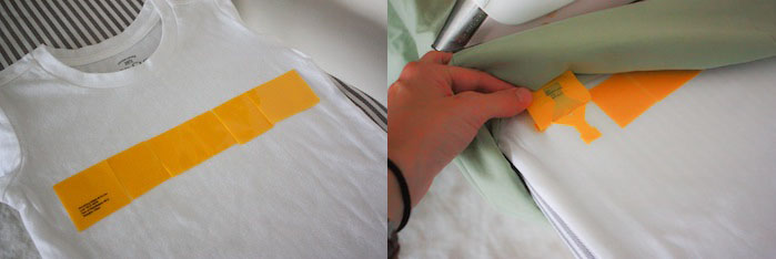
The application process for the letters is very simple: cut out the letters, arrange on the tee, cover with a cloth, and iron on high. Once the adhesive has melted to the shirt, the backing peels right off (though I found it best to wait until the plastic had cooled just a bit to avoid burned fingers…)
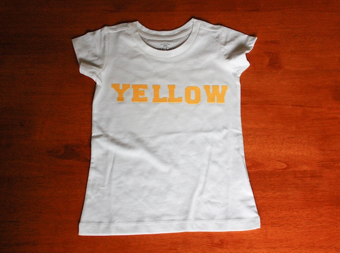
The first two shirts I made with my sister for her girls. We wanted to make simple, playful shirts in the style vein of Crewcuts and Zara Kids who tend to stick with a less is more design feel. We came up with a funny, very simple, YELLOW shirt for Jane, whose favorite color is, you guessed it: “Lellow.”
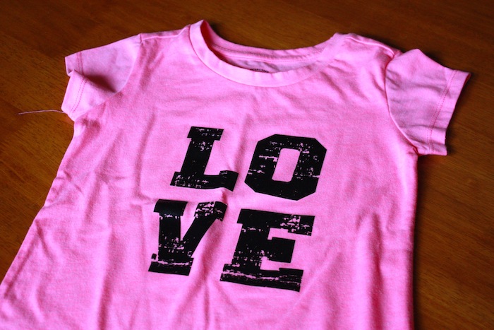
Jane’s older sister Elle got a more funky, LOVE square ironed on to a neon pink tee (you know, because neon is the new black!) The two girl’s tees both turned out darling, and I hope they love them.
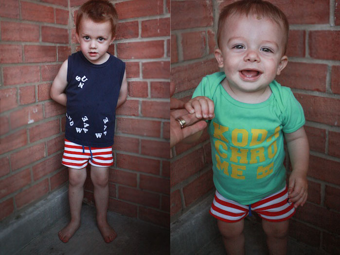
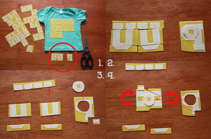
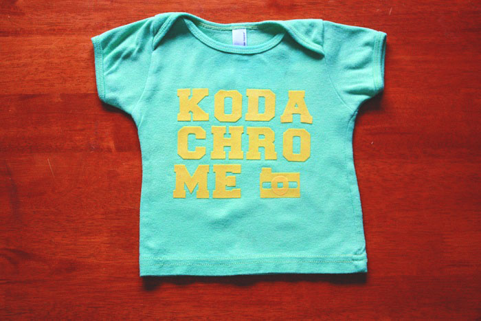
For my boys I got a little more creative. On Eliot’s tee I wanted to write the word “KODACHROME” referencing both one of my very favorite songs, and one of my first letterpress prints. When I lined up the letters, they fell on to three lines, which was fine. But the third line only had two letters, which left a random space. What I needed was a graphic of a camera…but all I had was letters! And here’s where my experience working with type came in handy. I just cut and pieced a little camera together from some of the extra letters.
1. I chose two U’s and a P for my camera pieces. 2. I Cut the tops and bottoms off of the U’s, cut a circle around the hole in the P, and took a little corner off of the P’s tail 3. I separated out the pieces and I was left with two halves of a square for the camera body, the circle around the hole in the P becomes the lens, and a corner of the tail on the P would be the shutter button. 4. Flip those U’s together, add the lens and shutter on top, and I’ve got a camera! (It’s a Nikon.)
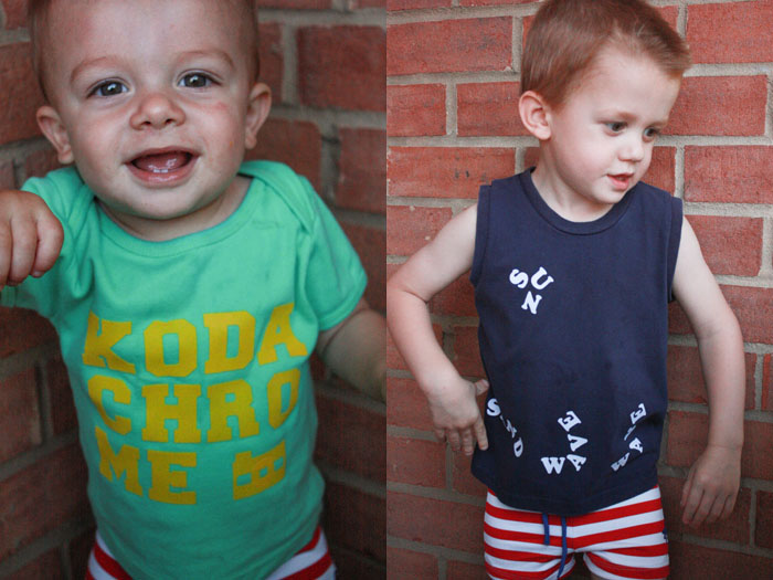
When I ironed the camera on, I started with just the U pieces and the rest of KODACHROME. After that was cooled off, I added the lens and shutter button on top, and ironed and peeled again. I am so happy with how it turned out! Such an awesome little hipster tee.
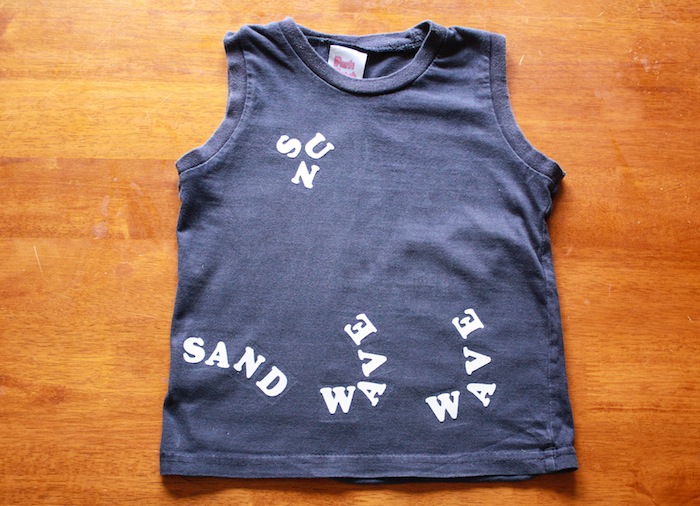
Milo got a sweet tee as well! I wanted to make him a beach-themed tee, like this or this, which use the same felted letters as these Iron-ons. Every phrase I came up with seemed silly, though. Milo is not a “surf warrior” or “beach baby.” After some thought, I remembered this print my sister showed me (she’s buying it for my dad for Father’s Day-so Dad don’t peek!!) and I decided to create a beach scene using the words as the graphics. I had just enough letters to draw a sun, the sand, and two waves before I ran out of A’s and E’s. It turned out cool, right? Again, I loved taking supplies I’d not normally think to use, and creating something totally up my alley.

