Attic Bedroom Suite
The attic bedroom and bathroom in Our Richmond Fixer Upper presented an interesting design challenge. While we planned to wait a year or two to do a full attic renovation, our timeline was moved up when the bathroom flooded, causing catastrophic damage to the room, and many of the rooms below in the main house. We had to move out for six months to repair the damage, and decided it was a good time to renovate the attic suite into a cozy and luxury-feeling retreat.
Reconfiguring The Layout
This attic bedroom was a renovation sometime after the original house was built in 1948, and before we bought it in 2018. Our guess from the pipes and fixtures is that the owners built up into the space sometime in the eighties.
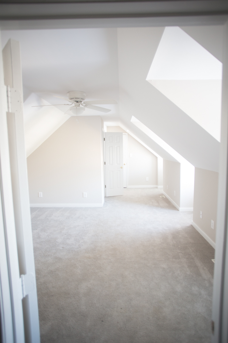
The fact the room had been created, and the small bathroom already had plumbing made our renovation easier. Before we got down to details, however, we needed to reconfigure the layout of the room. This is what it looked like when we bought it:
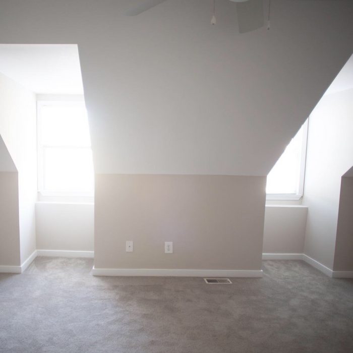
It was a nice, big space with one built in closet on the far left, a small bathroom behind it, and a second closet along the far wall. That left this main space for the bedroom…but that awkward space along the wall on the right. Because of the ceiling angle, you couldn’t walk comfortably along that edge, and furniture didn’t fit very well, so it ended up being wasted space.
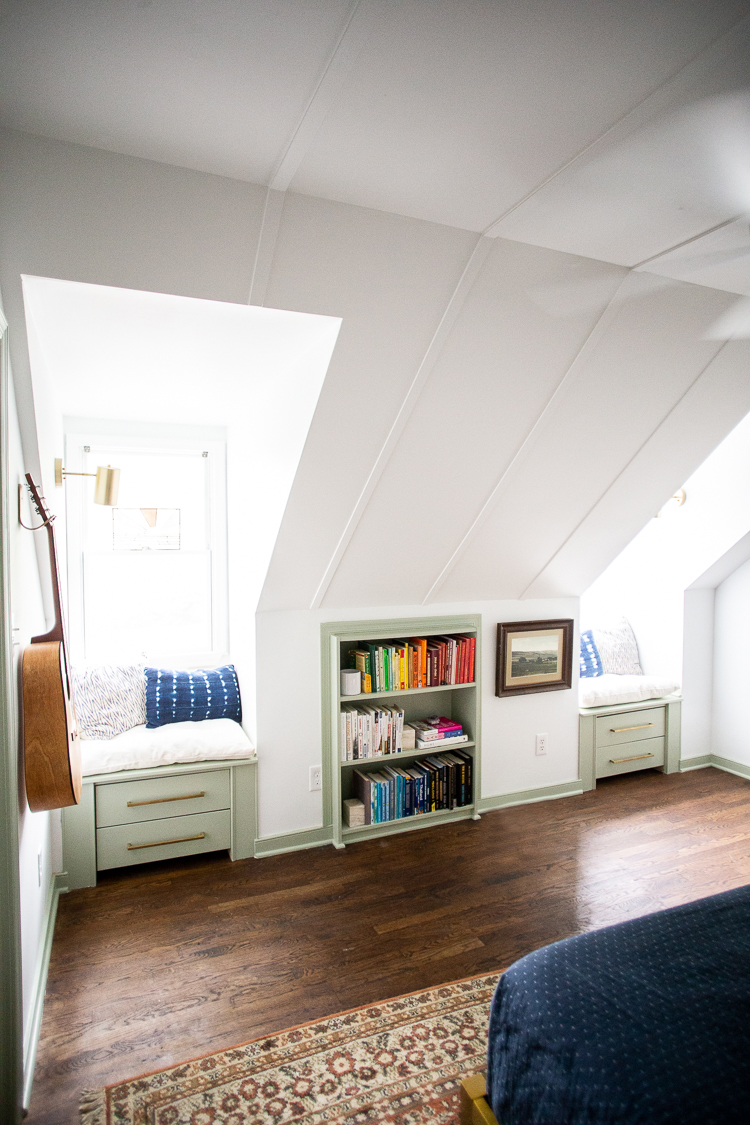
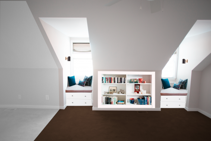
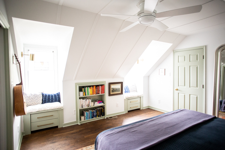
Also, while I loved the dormer windows, they were begging to be made into lovely little window seats, to be useful and beautiful. I also really liked the idea of utilizing the empty space behind the knee wall as much as possible by building in some bookcases and cabinets.
A quick photoshop mockup of this wall gave me a more clear idea of how this main bedroom area could be used.
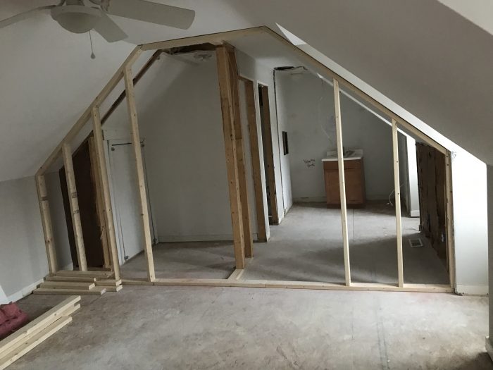
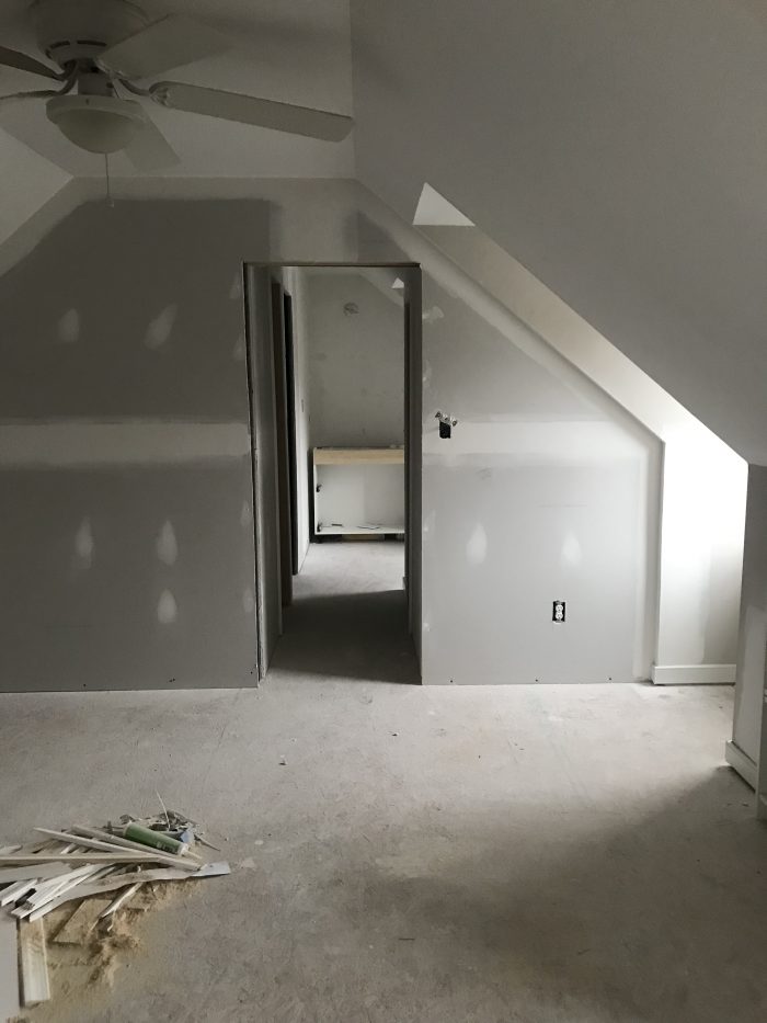
I also wanted to separate the bedroom from the closets and bathrooms by finishing that half-wall that made up part of the existing closet. By completing that wall, the whole room felt like a suite rather than an afterthought. By moving the existing wall up a little bit, we could include a pocket door to really separate the bedroom and bathroom spaces, but still keep them accessible to each other. Plus, I love a pocket door.


Ceiling Trim and Built Ins
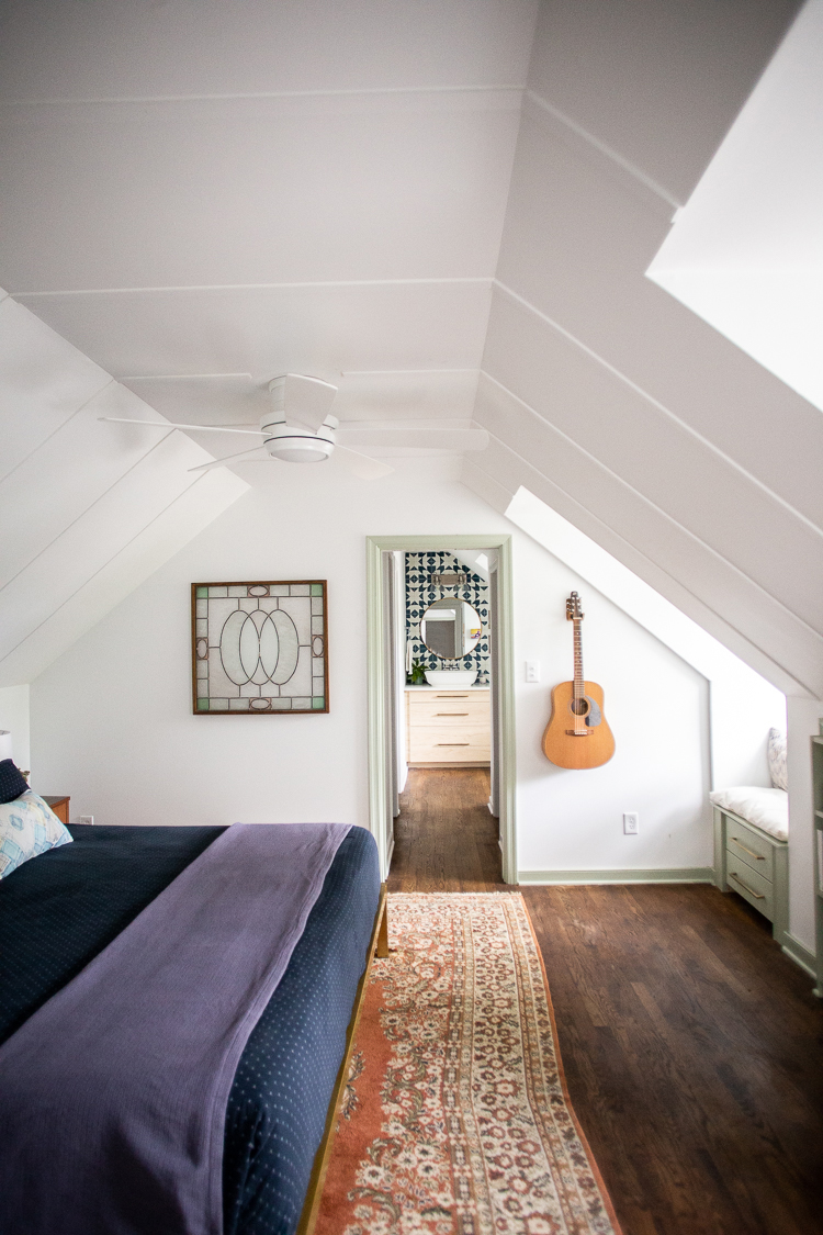
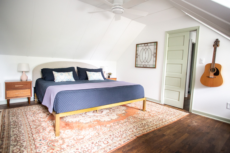
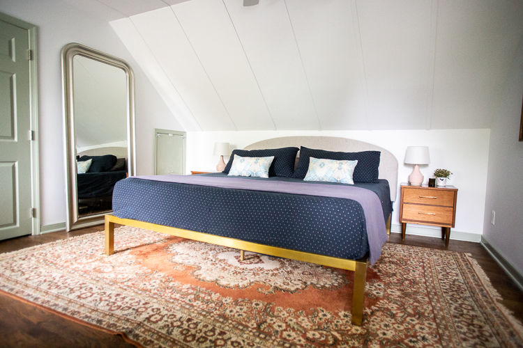
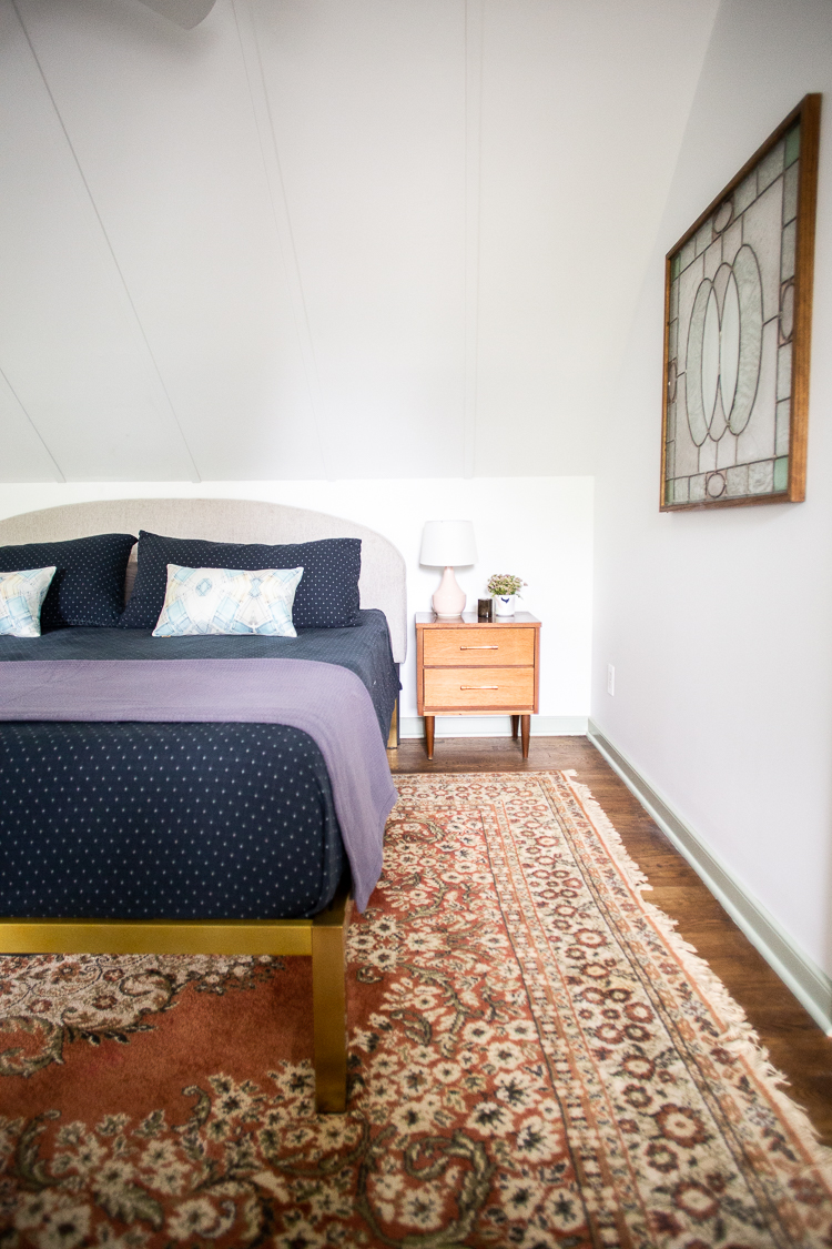
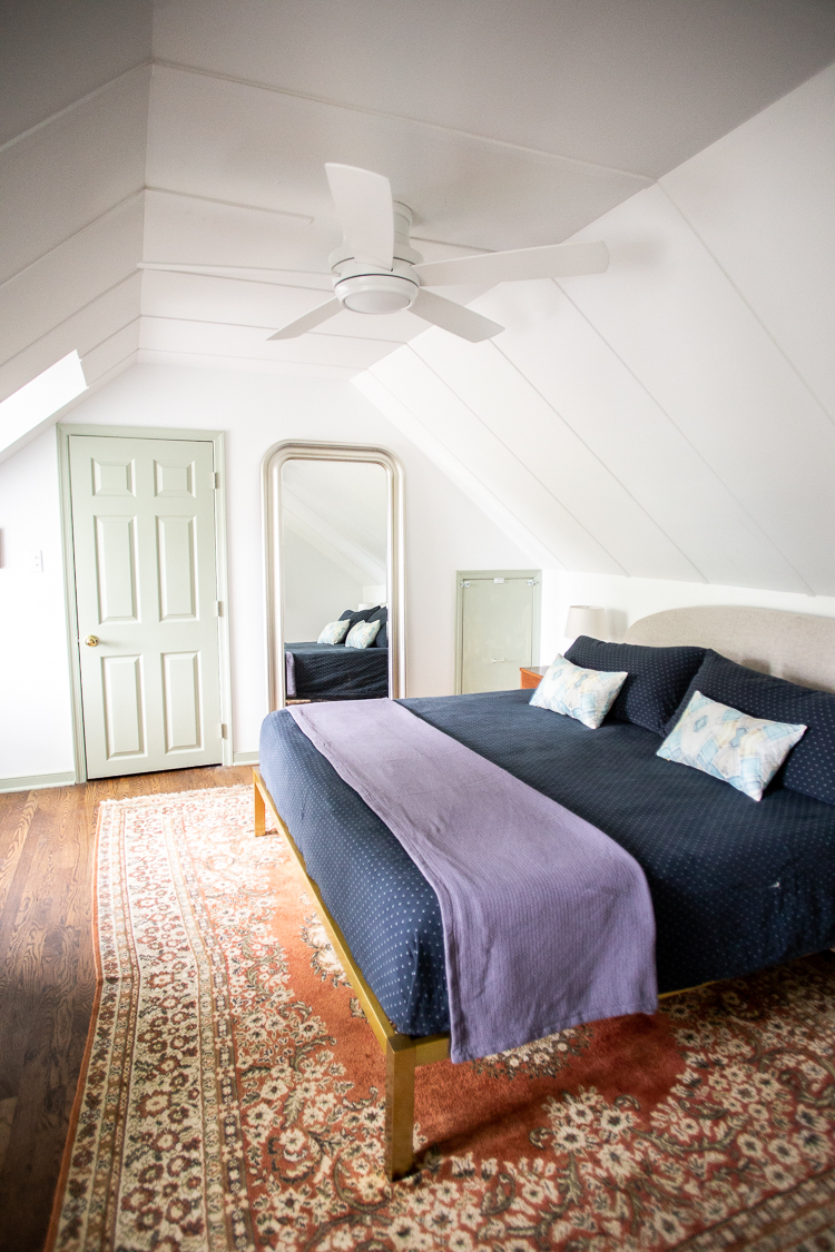
We added 1″ ceiling trim to accent the angled ceiling of the attic space and help it feel intentional. We also added the built-in window seats and bookcase to utilize all of the dead space of the knee walls. All of the little details and touches elevated this bedroom into a more luxury feeling retreat.
I choose contrasting green trim (Sherwin-Williams Softened Green) for a little bit of a vintage feeling, and kept the walls and ceiling all Sherwin-Williams Extra White.
Bedroom Furniture And Detail Links
Floor Mirror IKEA, no longer available (similar)
Rug, Vintage (similar)
Bedside Tables, vintage (similar)
Owner’s Closets
Once we had separated the main bedroom from this other half of the space, we could build in a second closet along the right wall. It is a small space, but we are intentional with our wardrobes and I liked the design challenge.
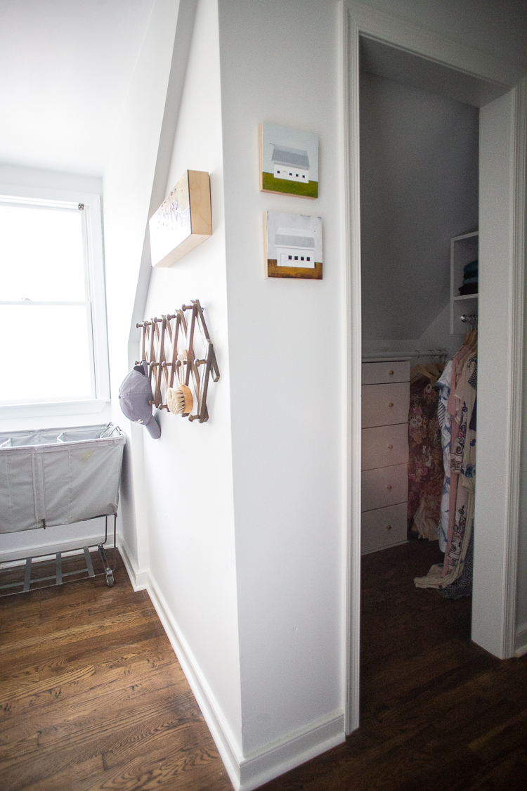
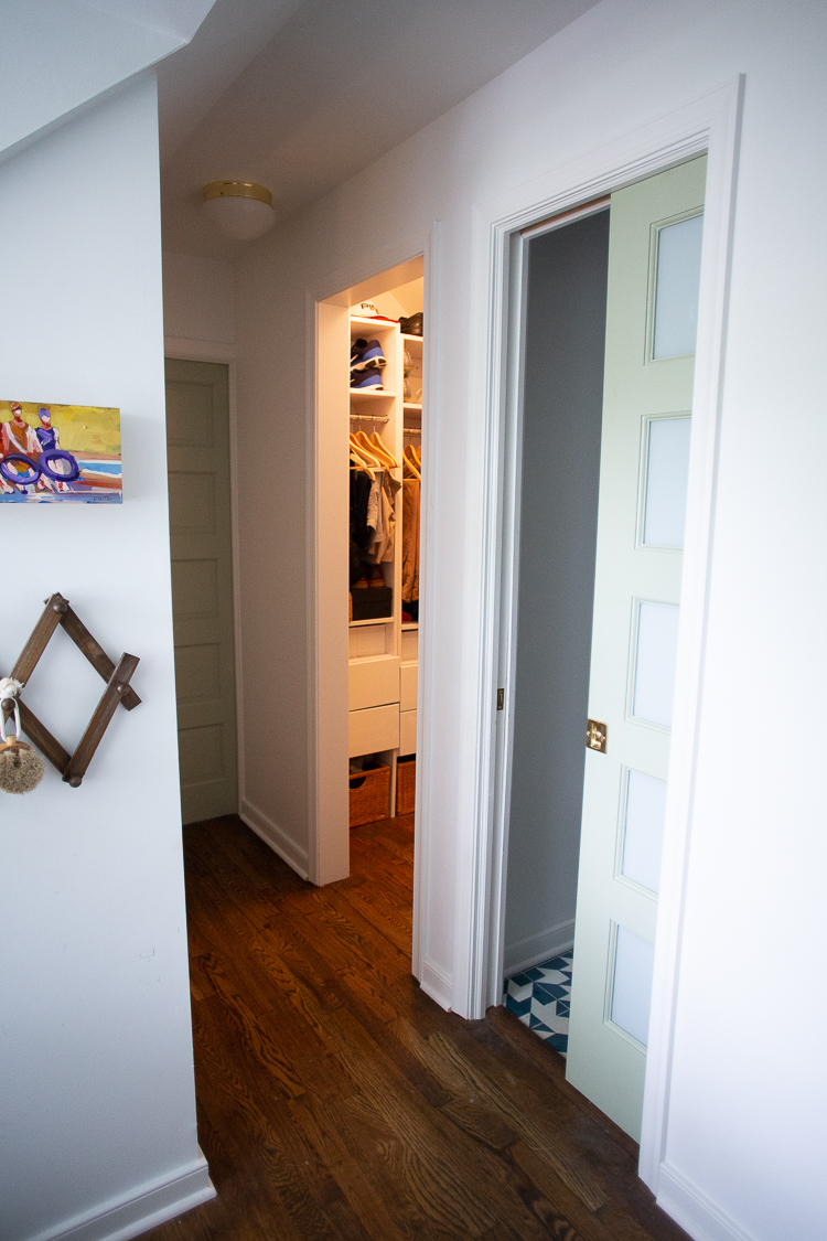
The closets have open doorways mirroring each other, and both have fully built-in closet systems with drawers, hanging bars, and shoe storage.
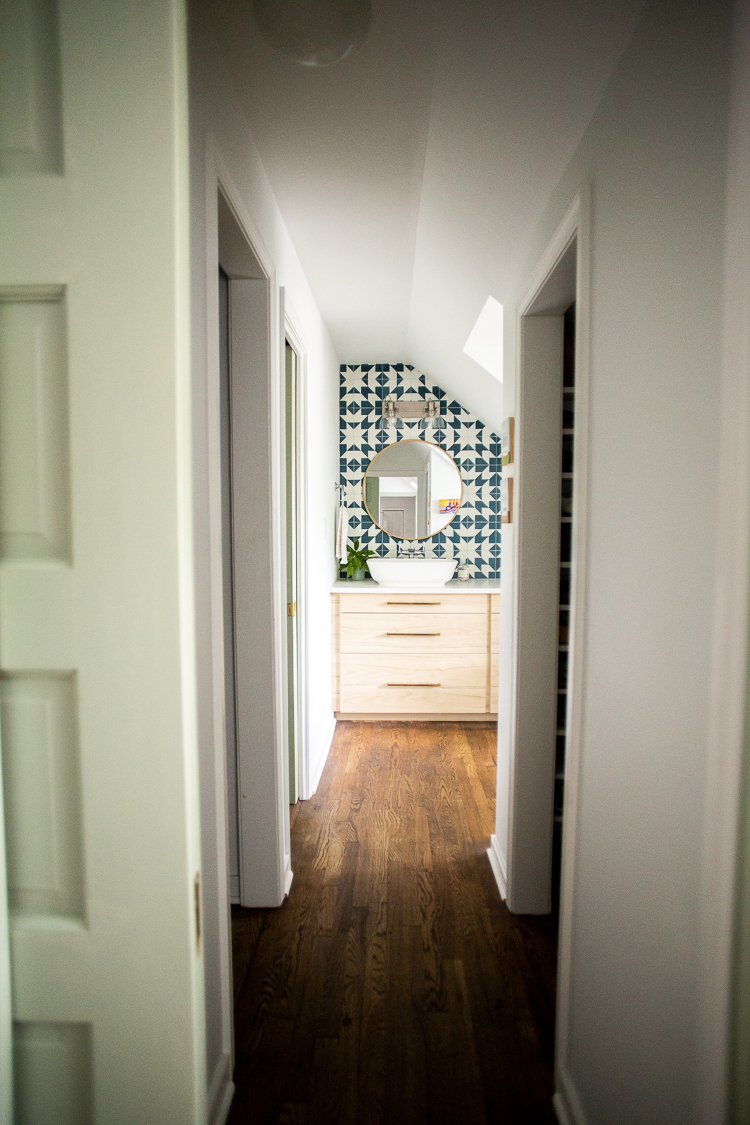
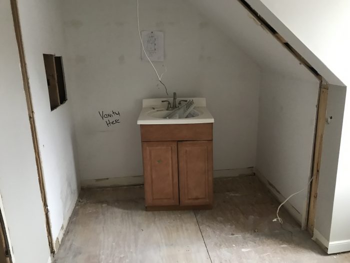
Creating a closet along this hallway enabled me to remove the closet that had been at the opposite end of the room, and use that space for the new built-in bathroom vanity and sink.
You can see some small peeks into the closets on either side of the hallway. We also left the space beneath the third dormer window open, without a window seat, because it fits our rolling Steele Canvas laundry bin perfectly.
Here’s a look at the process:
Expanding The Attic Bathroom
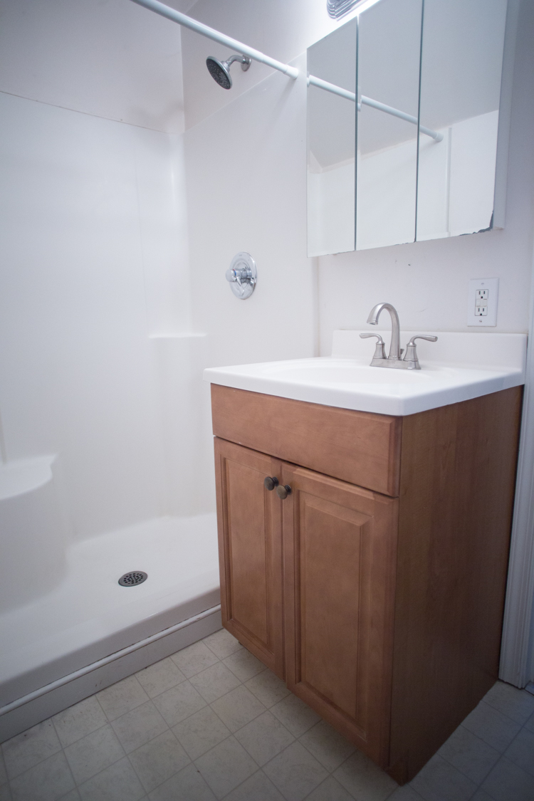
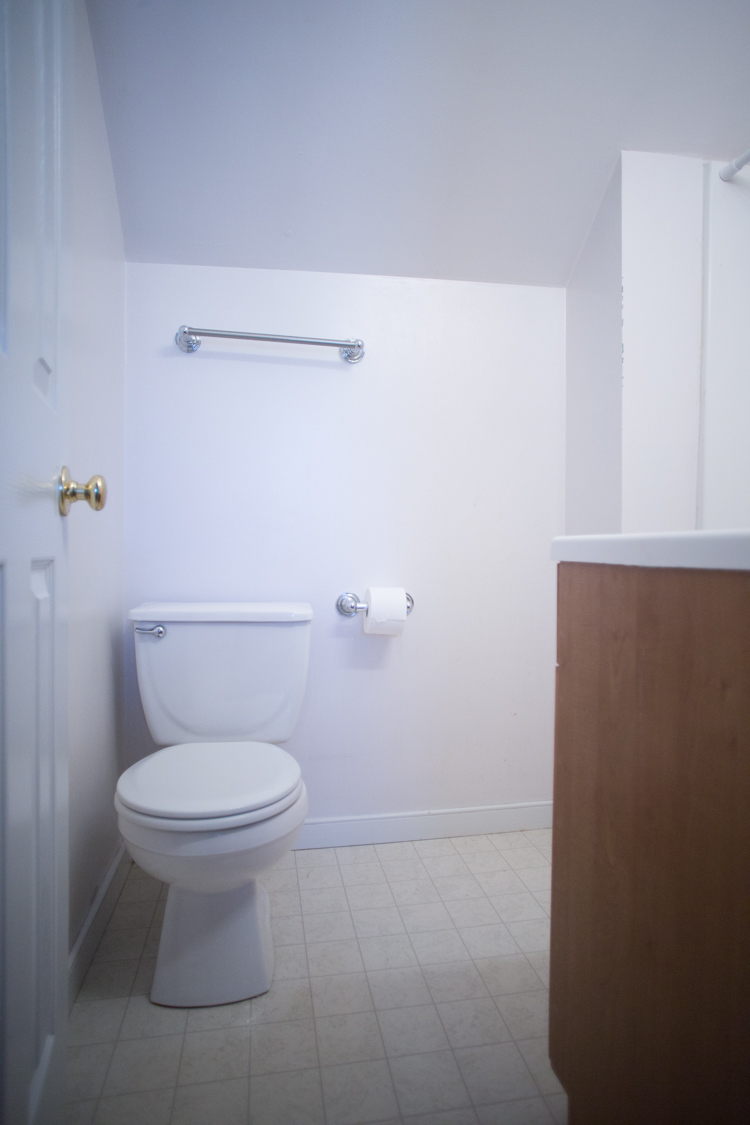
The previous attic bathroom was all contained in one, tiny space. It had a vinyl shower pan, toilet, and teeny tiny vanity with a medicine cabinet all within about 30 square feet.
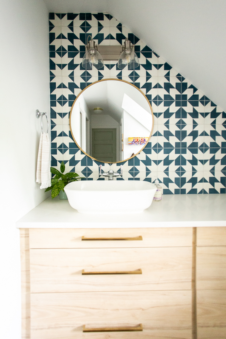
We enlarged the bathroom without moving any major plumbing lines by leaving the shower and toilet where they were previously, tucked into the corner room. We plumbed the vanity sink out through the wall and into the main area behind the closets, separating the sink from the toilet and shower, and making space for a huge, custom bathroom vanity counter and cabinets.
Again, the name of the game in a small house is to maximize storage and living space. I wanted this attic bathroom to feel large and luxury, despite being tucked into the eaves of a small, 1940’s house.
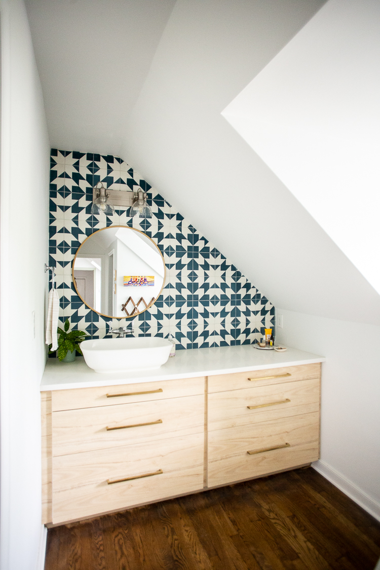
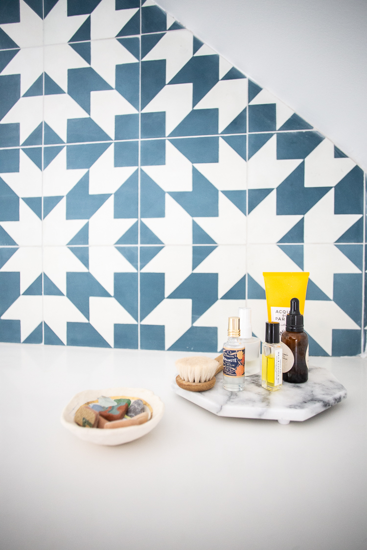
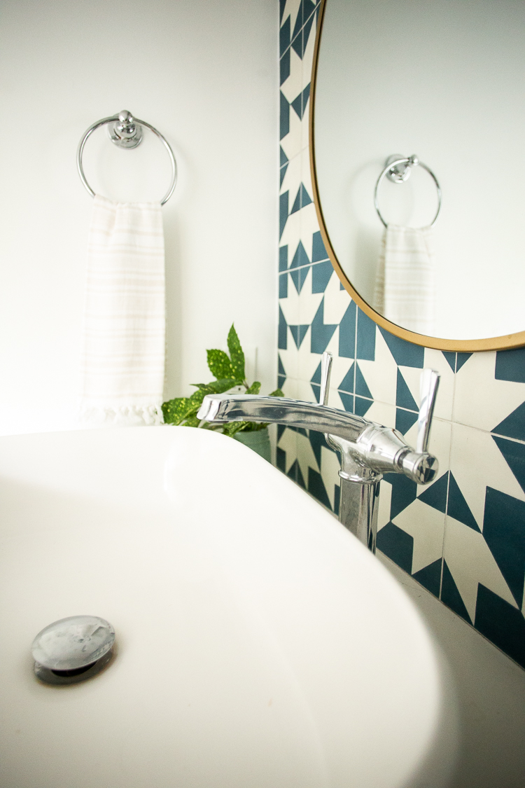
Making space for a huge, custom vanity with a fully tiled backsplash elevated this room into a really lively and luxe feeling space.
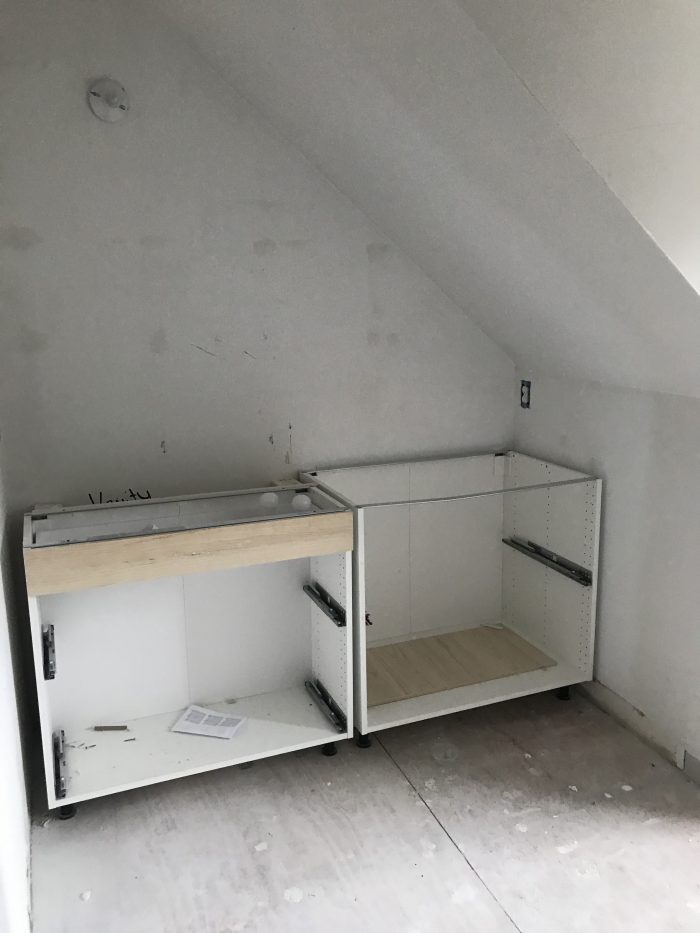
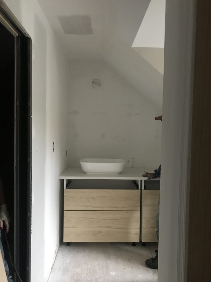
I used IKEA kitchen cabinets for the custom vanity. The left side are 15″ deep and the right are 24″ deep. Leaving the extra space on the left meant the sink pipes could run behind the drawers, keeping them fully functional. I also opted for a vessel sink to maximize the utility of the drawer space. Here’s a look at the process:
We were familiar with using IKEA cabinets from our Kitchen Remodel. For the vanity, I chose the light ash color cabinet faces, and was able to fit two 30″ wide bases into this nook, with some filler pieces in the middle and on the edges. I chose to center the cabinets on the wall, rather than have them shifted to one edge, and love the results.
I installed the cabinets, drawers, and filler pieces myself, and then the white quartz custom countertop was installed. The result is a beautiful, spacious vanity with tons of storage. It is exactly what we hoped for.
Bathroom Resources and Detail Links
Vessel Sink (similar)
Light Fixture (similar)
Attic Water Closet + Shower Combo
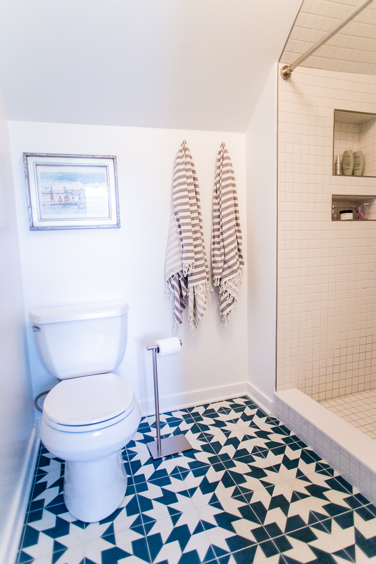
The final challenge in this remodel was creating a luxury feeling water closet and fully-tiled shower. Removing the vanity from the small corner bathroom made the space feel immediately larger. I opted to continue the tile from the vanity backsplash onto the floor in this adjacent room for continuity.
We choose a new toilet, and kept the toilet paper holder off of the wall, because the position is much more natural.
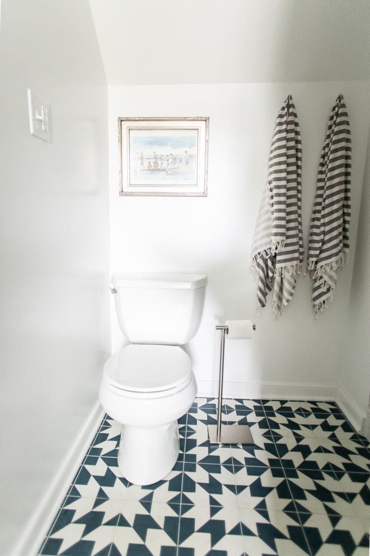
We gained several inches along the back wall for the tiled shower when we removed the old vinyl shower pan. We also took a few inches from where the vanity had been to extend the footprint of the shower out even a bit further, making the shower itself deluxe size. It feels huge and amazing!
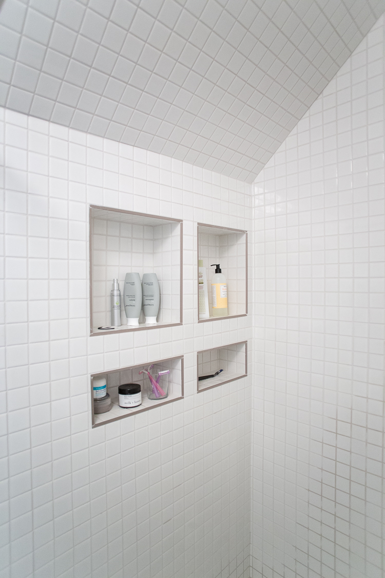
I fell in love with the idea of some small, stacked squares of tile. It felt like a fun contrast with the Americana feeling quilt-block patterned tile and also added some modern elements. The small tile looks amazing, especially with all of the angles of this attic space.
I took advantage of the opportunity to create plenty of niches- two for each of us. The taller holds bottles of body wash and shampoo, and the shorter for scrubs, razors, and mud masks. It is really fun to design something like this for maximum functionality!
All-in-all a massive improvement and update from the former bathroom:
Renovation Thoughts
While the flood that forced our hand on this upstairs renovation was tough in a lot of ways, we are grateful to have turned some of those lemons into the lemonade of a fresh, cozy, and beautiful attic bedroom and bathroom retreat.
The room went from a massive design challenge to one of my favorite places to spend time, read, and relax. I love how it turned out and hope some of these ideas might inspire you in your own homes!

