Grown-Up Kids Room with A Blue Accent Wall
This month in my room by room challenge I focused on my oldest son Milo’s room. This is the first time that he has had his very own room, since he was a baby, and he was so excited to help me make it his own.
While it is his own bedroom, it also doubles as the guest room when we have visitors, as our Fixer Upper doesn’t have space for a designated guest room. So, when we set out to design this room, we considered it becoming both a big-kid room and appropriate for adults and families when they are in town.
Navy Blue Accent Wall
Designing with Kids
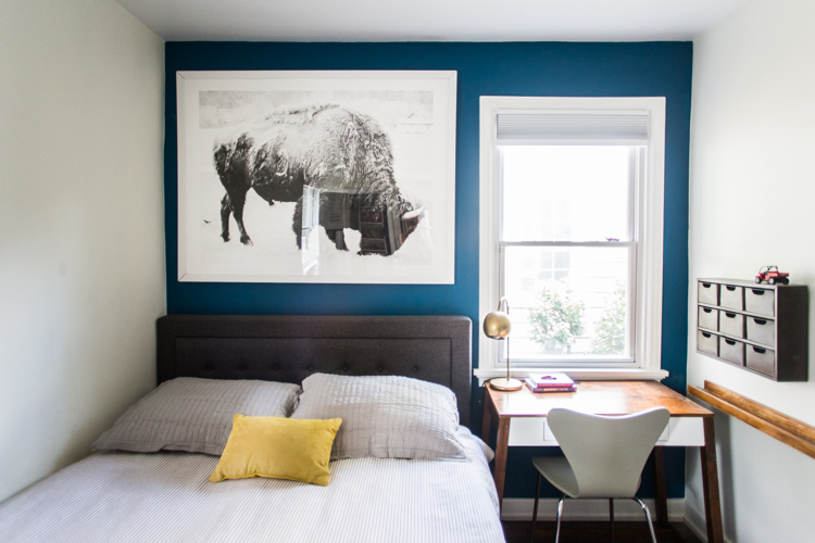
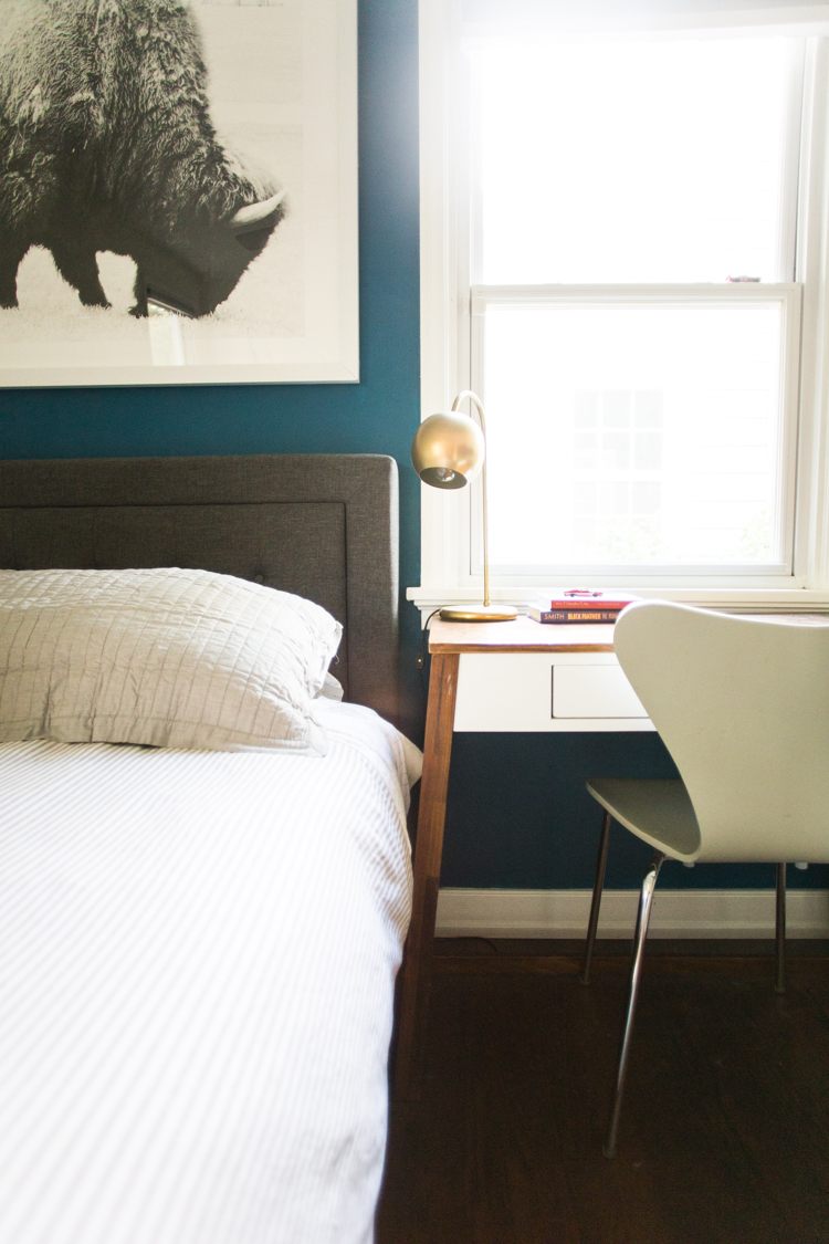
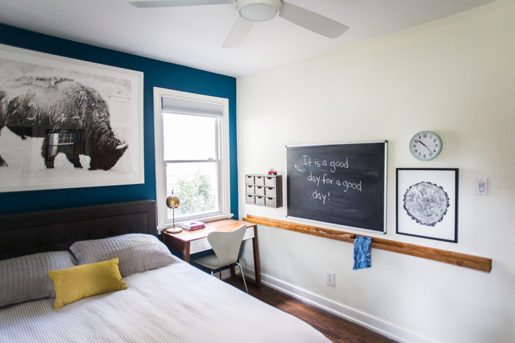
When I create spaces with my kids, I invite them to make decisions within some guidelines. In this room, I knew we wanted to have a great accent wall to anchor the small space. When it came to the color, that was Milo’s choice! He loves blue, and this Sherwin-Williams Oceanside Blue jumped out at both of us. When we first started putting it on the wall I was shocked because it looked SO BRIGHT! Luckily, with a second coat it toned down into a beautiful navy blue.
Choosing a Dark Color in a Small Space
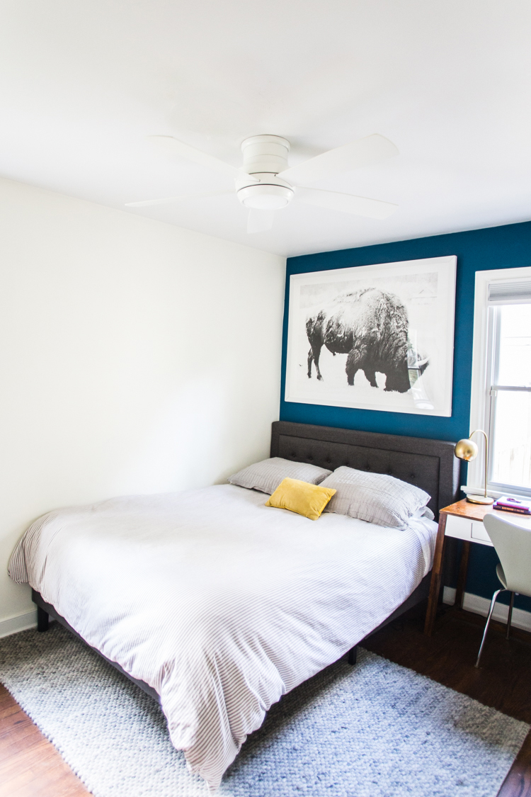
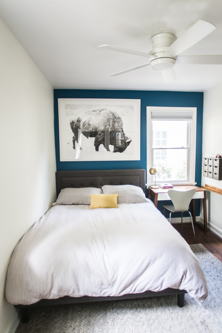
Sometimes people think that paining a dark color in a small space will make the space feel smaller, but in most cases the opposite happens! This tiny room opened up a ton with the blue wall receding into the background and the rest of the walls bright white.
The dark wall defines the space and creates a really cool tone. The rest of the room can then play off of the accent wall and the details all come together really well.
Big Kid and Guest Room Combined
A couple of the choices we made for the room were specifically because this room doubles as a guest room. It is a bedroom for a nine-year-old that also transitions seamlessly into an adult guest bedroom. Here are some of the specific design details that we considered to make this transition possible.
Queen Bed and Neutral Bedding
In order to accommodate an adult couple who may visit (usually my parents or in-laws) we decided to get a queen bed, even though Milo would only need a twin for himself. We found this great, upholstered headboard on the local facebook marketplace and he approved of the sleek, neutral design.
The mattress is from Lucid, which is our favorite mattress company and so soft. He chose a hybrid bamboo + charcoal mattress and it is seriously so comfortable. I am happy that he is cozy and know that our guest will be comfortable too!
The sheet sets are from Target, and the duvet cover is from Restoration Hardware a few years ago (similar here).
The beautiful hardwood floors shine in this bedroom, and I also wanted the bed area to feel cozy underfoot, so I added a simple woven rug to add some texture around the bed.
Contained Toys and Books
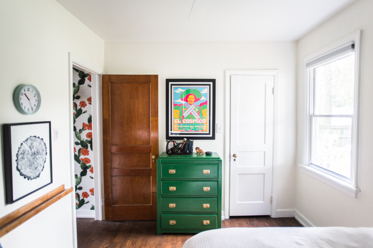
I like to think of design as being practical and pretty. Where will the toys and books that have a real place in my sons life live in his real room? We designated one of his dress drawers. This green dresser was one of my mom’s pieces of furniture that she gave to me when Dave and I were married. A few years ago I painted it green, and I still love it so much.
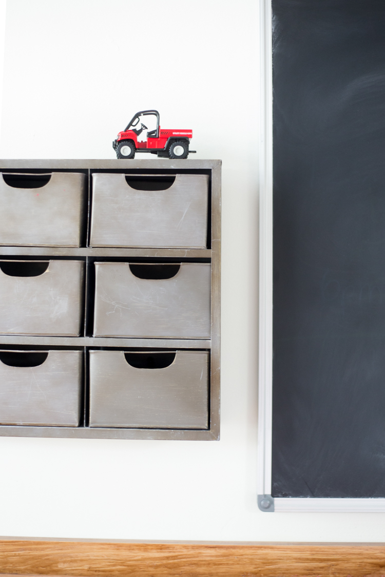
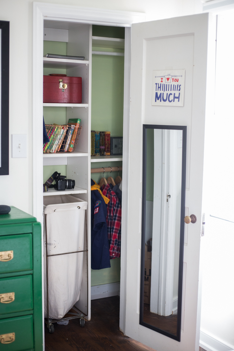
Other small toys are relegated to the metal file drawers on the wall, and the books live in baskets or on shelves of the closet.
This closet is actually much larger than Milo needs right now, but he will grow into it. I added some hanging bars in places there didn’t exist before, and cut some shelving out to make a space for his rolling laundry cart from Steele Canvas. We have one in every bedroom and they’re our fave.
Art and Chalkboard
When it came to the art in the room, I went with a collaborative effort. Milo got to give the “okay” for what went up, and also got to choose one of his own.
The oversized bison print is from Minted from a few years ago. It is one of my favorite large format pieces and I was excited to have a perfect place to hang it on this small wall. I also chose this stump print that reflected the same outdoors feeling and black and white format as the bison.
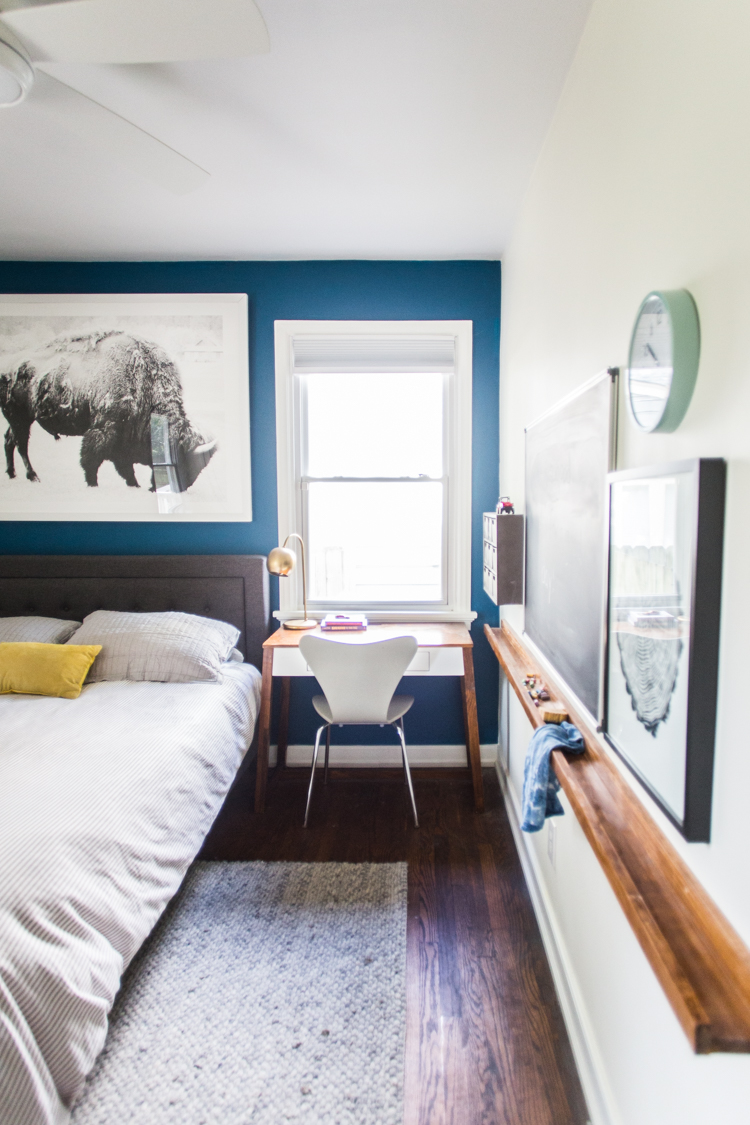
Milo spotted this cool Pancho Villa poster at El Cosmico when we were driving through Texas this summer, and it was the last perfect piece for the space. I framed it with a black poster board as backing, to create the striped mat look. I love the way it turned out and mirrors the green in the dresser.
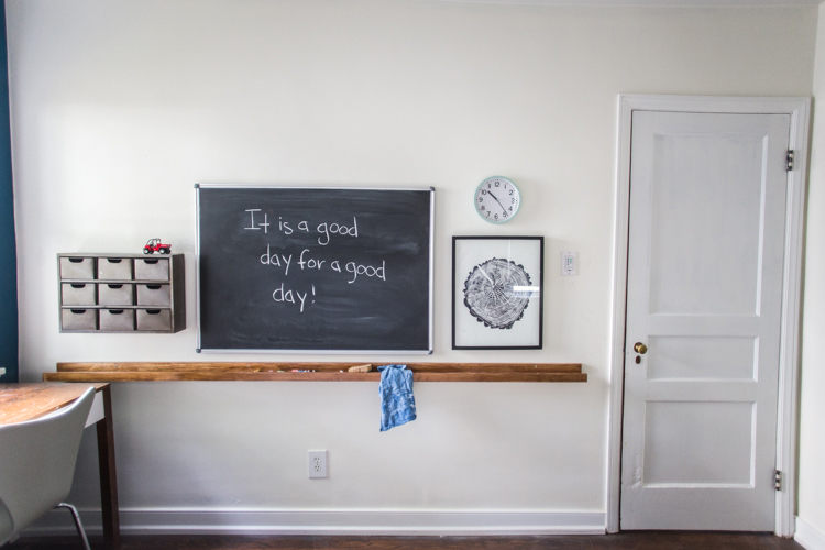
The large chalkboard was the last piece that I wanted to hang in the room. I was having a hard time figuring out how to make the wall next to the desk useful without adding any bulk. The chalkboard gave the wall utility and also gave me the idea to add a small shelf below and turn the space into a sort of interactive work space.
DIY Wall Shelf
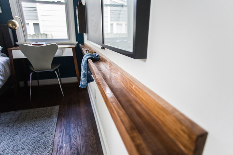
Beneath the chalkboard, I wanted to add a long, narrow shelf to hold the chalk as well as other small toys and treasures. I settled on a whole 8 foot long shelf, both because it fit the wall perfectly and because the wood pieces come in 8′ sections, so I wouldn’t have to do any cutting!
I gathered 2 1×2’s and 1 1×3, and went to work glueing and screwing the pieces together. Once the shelf was stained, I anchored it to the wall.
I have a post planned to show the full step-by-step tutorial of the shelf building.
Ceiling Fan and Window Treatments
The final details in the room included changing out the old ceiling fan for a sleek, new model. I chose this Tempo Hugger Fan from CraftMade. The fan has three speed settings, an LED light, and is basically ceiling fan perfection. I love how modern it looks and how it almost disappears into the ceiling. The controls are all in-wall, which means they are added as a small key-pad to where the light switch would go. I’ve been so impressed I added two more to the house, too!
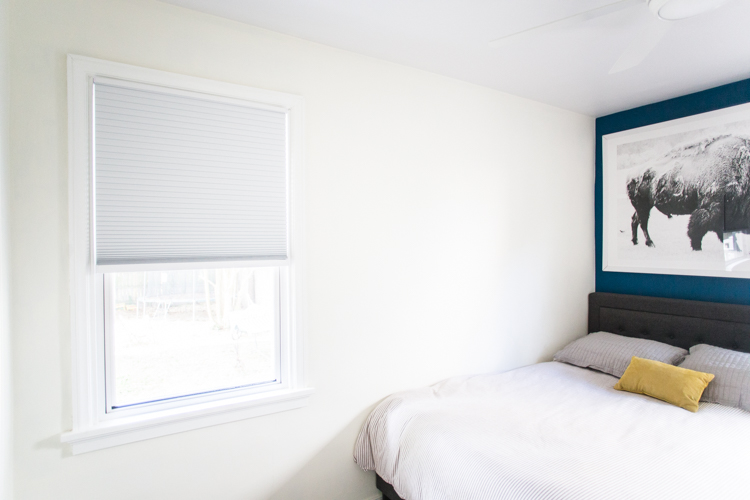
The window treatments in this room are similar to the other kids’ bedroom: blackout cellular shades. They can be ordered in any size, and come fit to your window. I love how simple they are to install, and how easy to use. They are cordless, which means I can pull them down and lift them up without worry of cords being in the way. Perfect for privacy, sleep, and still looking sleek in the room.
The Before
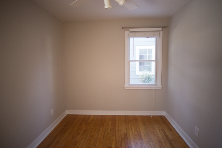
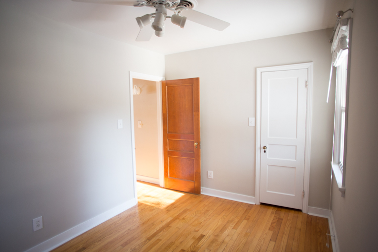
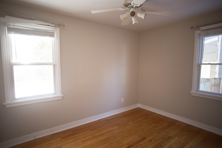
At the end of a big redesign, it is always fun for me to look back at where we started. This small bedroom had some great windows and a nice layout, and other than that just needed lots of intentional design and updated lighting and window treatments.
I am always surprised how much bigger a room looks once it has been painted, and furniture has been added in interesting and thoughtful ways.
The After
After this month, both downstairs bedrooms have been finished, along with the hallway and bathroom. I began with the other kids’ shared bedroom in August, tackled the black and white bathroom in September, and finished this room in October.
Next month I will be putting finishing touches on our green kitchen, which was already fully remodeled, but has a couple details yet undone. Then during the holidays will move on to small projects in the living room and study.
It feels so good to approach each room at a time, giving it my attention and focus until it is done. This bedroom with the bold blue accent wall is now one of my very favorite spaces!

