Paint Colors of Our House
In the last two years, we have brought all of our interior and exterior dreams for this home to life in our fixer upper, and I wanted to answer an often-asked question in one place: “What paint colors did you use?!”
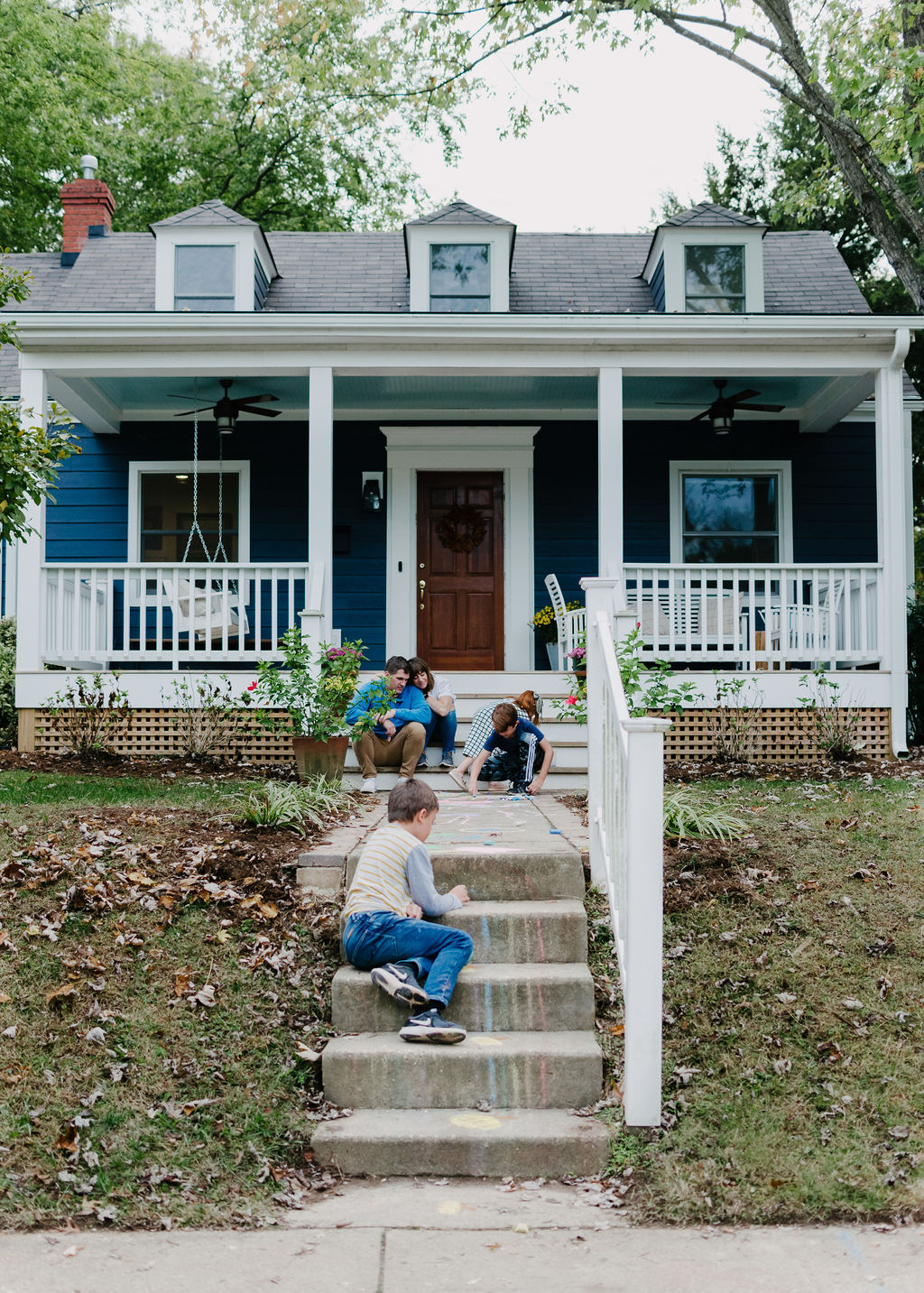
When we bought Our Richmond Fixer Upper in early 2018, we knew we would be doing a full interior and exterior renovation. I came to our first showing of the house with a photoshopped rendering in hand of my vision for the exterior (complete with new, moody blue siding and a huge front porch addition.)


Exterior Paint and Trim
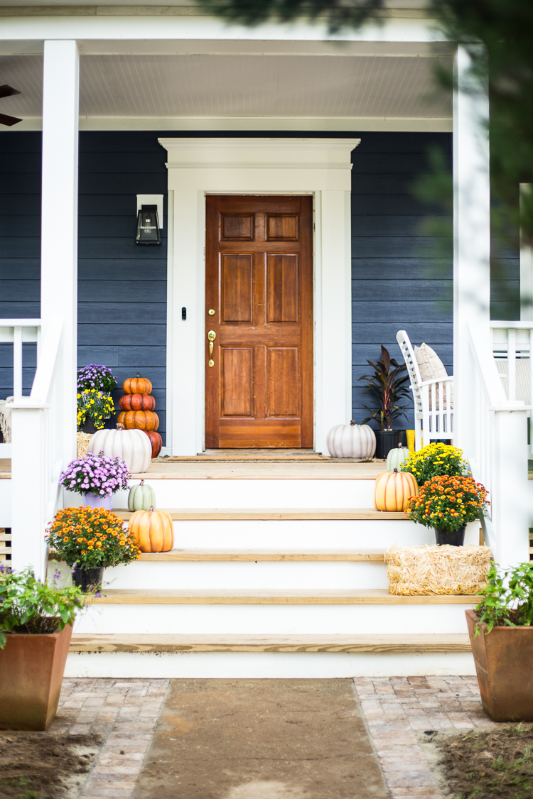
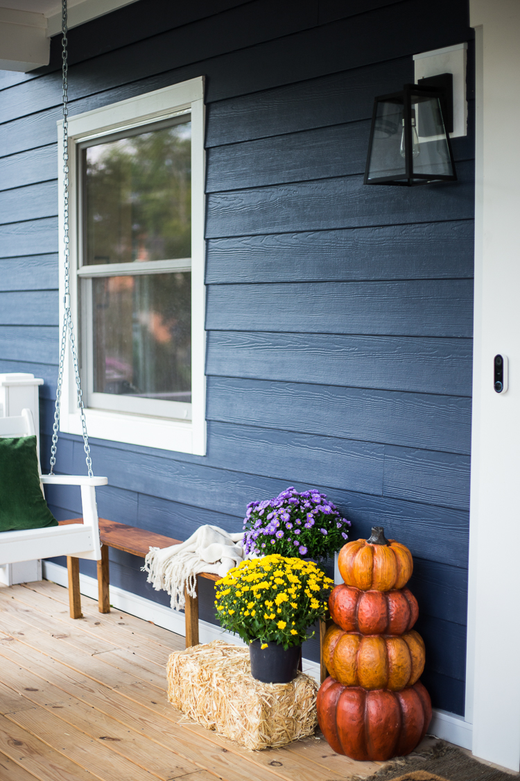
While traveling in Amsterdam a few years ago I fell in love with the beautiful, dark house exteriors, and decided I wanted my next house to be dark blue. After completing our front porch addition, we decided to use James Hardie cement board siding in Deep Ocean.
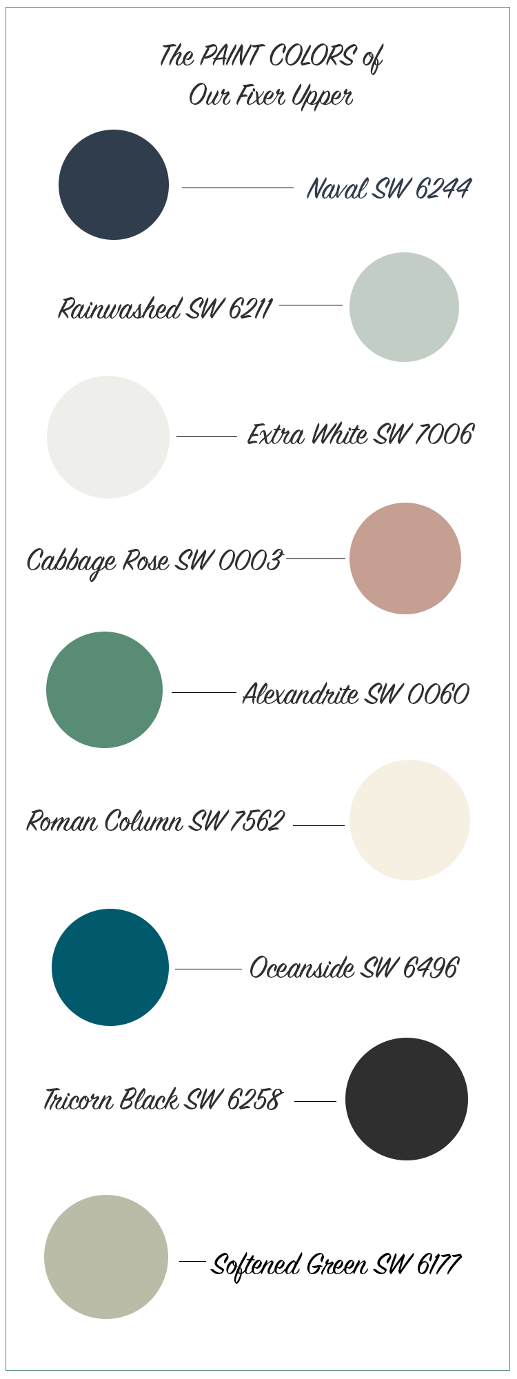
The James Hardie siding is pre-colored, meaning the color is formulated into the boards themselves. This appealed to us because of the long-lasting durability of having exterior siding that never needs to be painted or touched up again! Even though the siding isn’t actually painted, we did want a great color match so we could paint our backyard clubhouse to match. The perfect match is Sherwin-Williams Naval.
Likewise, the exterior trim came pre-colored in James Hardie Bright White, but we did have to paint the existing wooden door trim and other areas on the porch with the color match of Sherwin-Williams Extra White.
The final color on our exterior is the porch ceiling, which we wanted to paint a beautiful light blue (or “Haint Blue” as they say in the South.) I took one of our backyard chicken eggs to Sherwin-Williams and color-matched it to the lovely Rainwashed.
The Main Living Area
I love the brightness of clean, white walls, and my go-to color has always been Sherwin-Williams Extra White with an extra 4 oz of white added per gallon, to make the custom mix my friend Mandi of Vintage Revivals calls “Mandi White.”
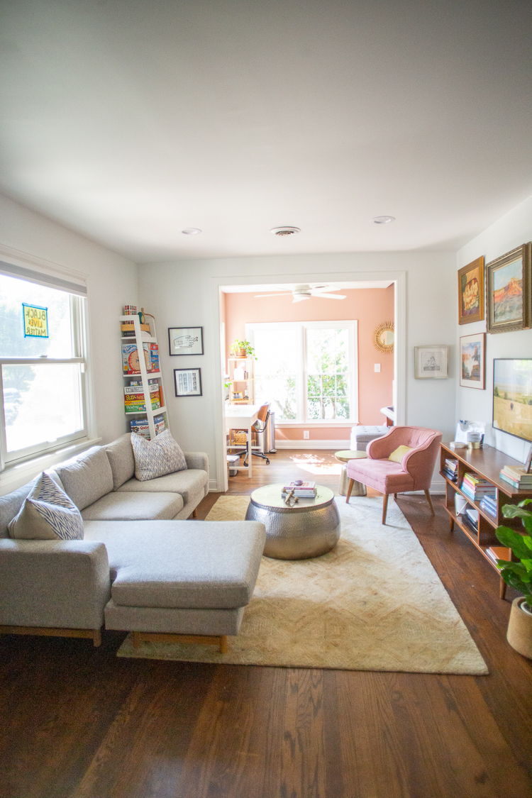
With a base of Extra White on all of the walls and trim, I set out to customize our little home with cozy corners and touches of fun paint colors to make it feel welcoming and whimsical. One of the first places you notice this warmth, when you come through the front door, is in our Cabbage Rose sun room.
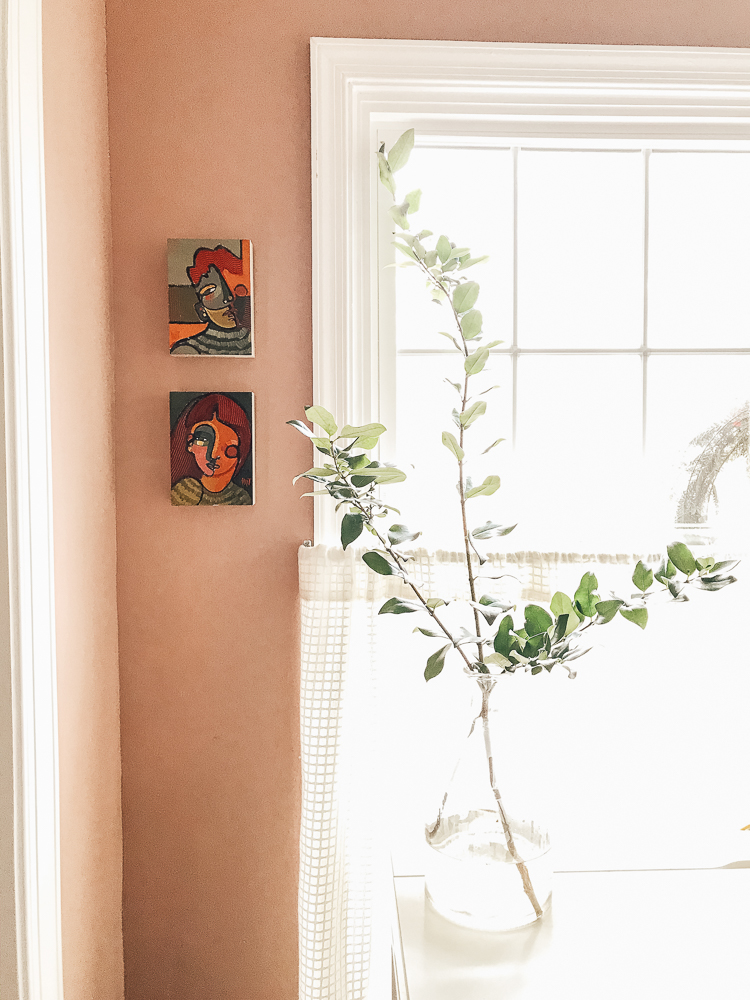
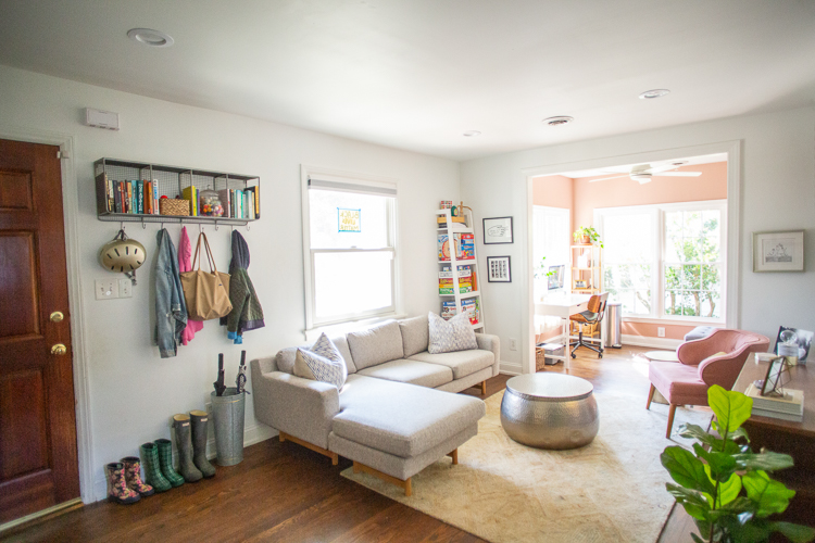
I love the way the dusty pink room brightens up the whole main living area of the house! It is the most beautiful color (I was inspired by the gorgeous pink buildings in Rome). The color also plays well with my favorite dusty pink chair, and my collection of vintage southwestern landscape paintings.
Our Happy Green Kitchen
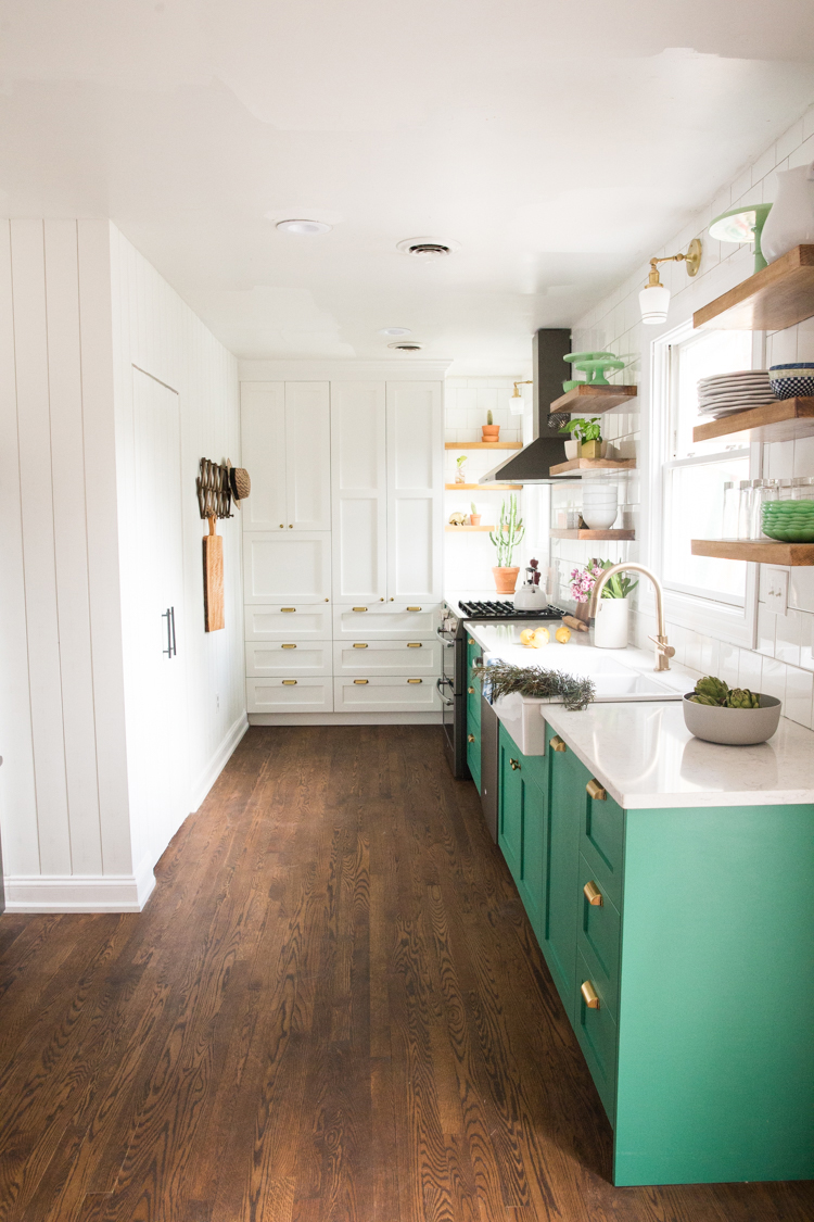
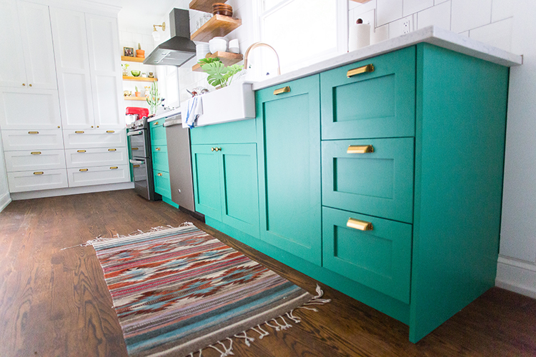
The next fun color you will encounter in our home is our bright, happy green kitchen! I knew I wanted some fun color in this small kitchen space, and kept coming back to the lovely aging look of verdigris copper which has sort of a bluish green hue.
Sherwin-Williams Alexandrite turned out to be the perfect color to capture the feeling of joy and love in this space. I painted all the cabinets myself with my trusty paint sprayer, and they are beautiful. The rest of the walls and cabinets in this room, including all of the vertical shiplap trim, is Mandi White.
The Black Bathroom
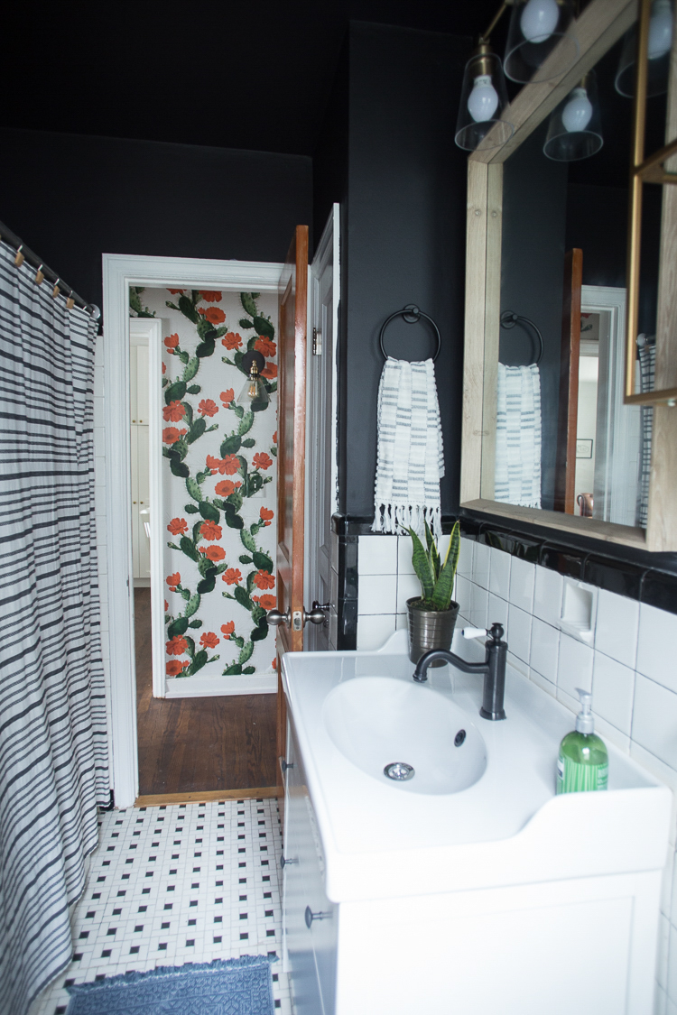
Our main level has one small bathroom with amazing original 1940’s tile. I wanted to make it feel more modern while keeping the charm of the tile, so I decided to make the whole space dark. Black isn’t usually a popular choice in house paint colors, but can make a great impact!
My favorite black paint is Sherwin-Williams Tricorn Black, which not only was used in this space (including the ceiling) but also to paint the black on our Dutch Door in the kitchen and the black exterior door of the clubhouse. It is a perfect, deep, full bodied color and I love it.
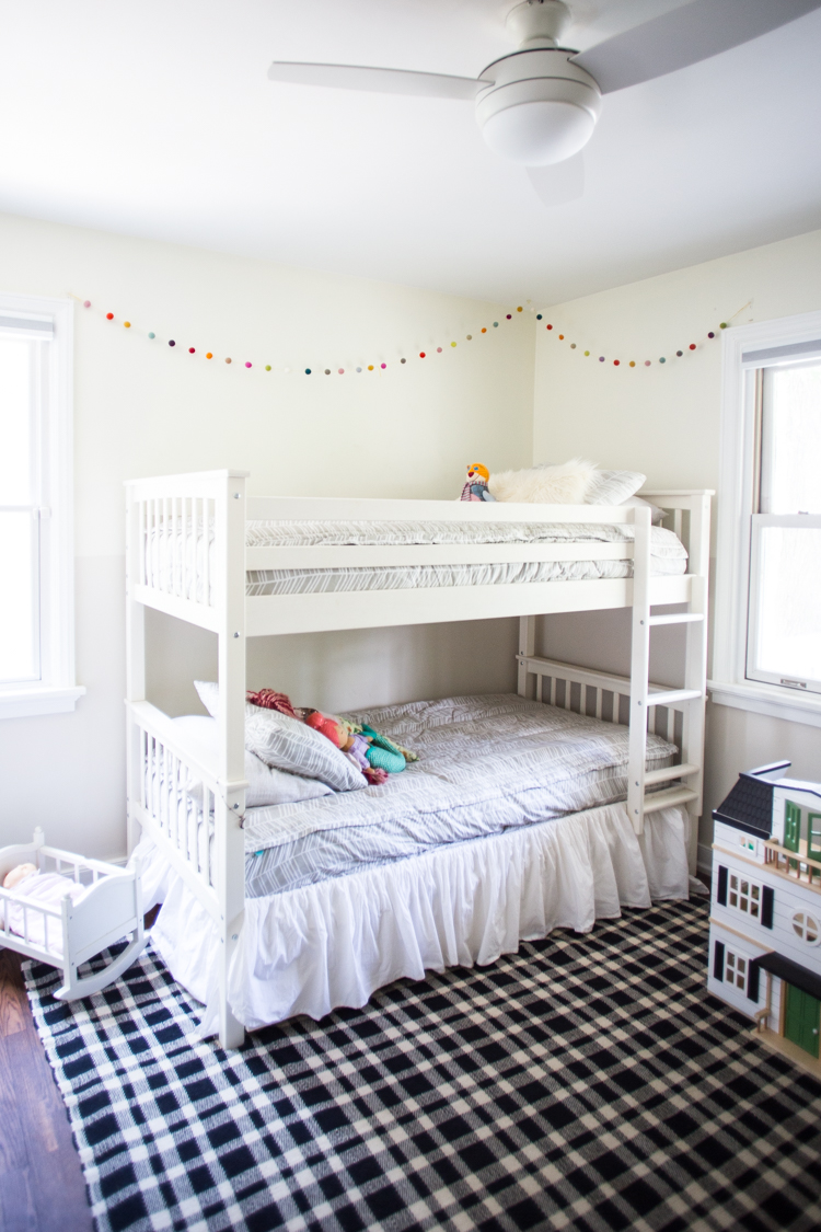
Neutral Kid’s Room
I wanted to keep the shared kid’s room fairly neutral, but with some sort of interesting design element. We did a very subtle two-tone color blocking on the walls, using Sherwin-Williams Restful White (SW 7563) and Neutral Ground (SW 7568). The result is a beautiful, warm white with a hint of depth from top to bottom.
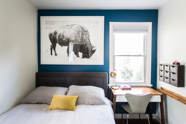
Grown-Up Boys Room
Our oldest son has his own tween bedroom, that doubles as a guest room when we have visitors. I wanted to have a little punch of color and depth in this small bedroom. Adding an accent wall of Sherwin-Williams Oceanside was a perfect solution.
To balance the coolness of the dark blue, I painted the other three walls with the creamy Sherwin-Williams Roman Column. It is one of my favorite warm whites and adds just the right amount of coziness in here.

The Owner’s Retreat
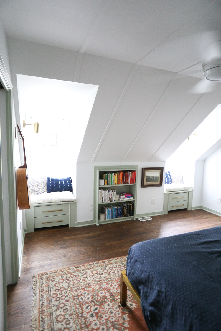
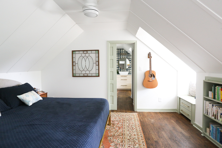
The final room in our small home is our attic bedroom, or as we like to call it, The Owner’s Retreat. When we remodeled this space into a really intentional Owner’s bedroom, closets, and much larger bathroom, we decided to switch up the paint with some reverse contrast trim.
Rather than painting the walls with color, we added this beautiful Sherwin-Williams Softened Green trim to the doors, moldings, and build in window seats and bookcase. It is a pretty, historic way to bring subtle color into the space while still keeping the brightness of the white walls and ceiling.
Paint Colors: Choose What You Love
My final word on paint colors is that there are no right or wrong choices (no matter what the internet may try to tell you!) You can fill your house with color, or paint everything white. You can choose moody hues, do accent walls, or even cover the spaces with bright murals like my friend Banyan Bridges!
The most important thing to remember is that YOU will be living here, so make it somewhere that YOU love!

